Audi Design System
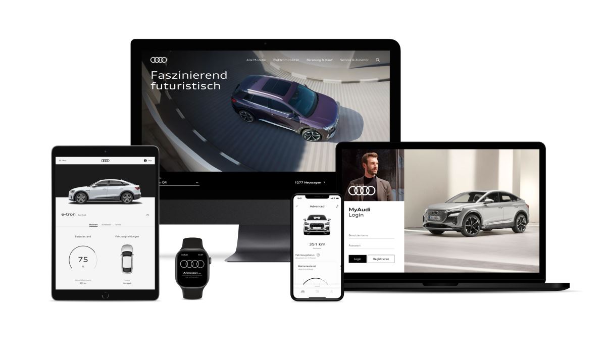
Audi user interfaces come in a wide variety to match their functions, from applications for specific services to creative websites.
Visit Website
Audi user interfaces come in a wide variety to match their functions, from applications for specific services to creative websites.
Visit WebsiteAudi user interfaces come in a wide variety to match their functions, from applications for specific services to creative websites. The goal is to develop a variety of options and a well-balanced user experience across the entire system, from the app to the vehicle. An integrated collection of components, modules, and animations serves as the foundation for this.
The application's components and layout provide a variety of choices for the creative presentation of content and functions. The primary focus is on the needs and activities of the user. Options for user involvement are crafted with simplicity and clarity.
Audi is a brand that is more than just its outward appearance. What constitutes contact with the brand across all applications and devices must also be questioned when it comes to interactive channels.
Audi committed to making customer interactions as easy and enjoyable as possible in order to make the connection memorable and encourage long-term brand loyalty. On the way to accomplishing this objective, the UX paradigms offer a common framework for creating fresh concepts and pursuing continuous improvement.
Audi customizes this service to offer a unique user experience to every customer.
Each user has different habits, needs, levels of mobility, personal gadgets, security concerns, and privacy concerns. We therefore give users the option to modify or add to content in accordance with their personal tastes.


The Pluralsight Design System strives toward a cohesive design language for Pluralsight’s products, a shared vocabulary for their teams, and basic building blocks to accelerate development.
Get in-depth information and UI resources for designing great apps that integrate seamlessly with Apple platforms.
The SEEK styleguide's purpose is to enable the creation of content that will assist our users to complete tasks easily and hopefully enjoy the experience.
The ServiceNow Design System is a living system that empowers us to design and achieve a consistent, efficient, and high quality visual language that brings cohesion and familiarity to the user experience across the platform.
Nachos is Trello's design system. This comprehensive guide and resource library contains everything you’ll need to design with us, including our core principles, visual design and interface components.
Photon is the Firefox design language to build modern, intuitive, delightful experiences, for products across all platforms – from mobile to desktop, from TV to the next big thing.
Our user interface components enable you to quickly and easily create Industrial Internet web applications that run on dedicated Predix services and data.
This library showcases the building blocks that make up Hubspot's design system, from colors and typography to React-based components and data visualization tools.
GEL is the BBC's shared design framework which enables us to create consistent and delightful user experiences across all of our Digital Services.
The styleguide is a resource that provides a common language around Yelp’s UI patterns. We use it to maintain modular front-end code and visual consistency across the web app.