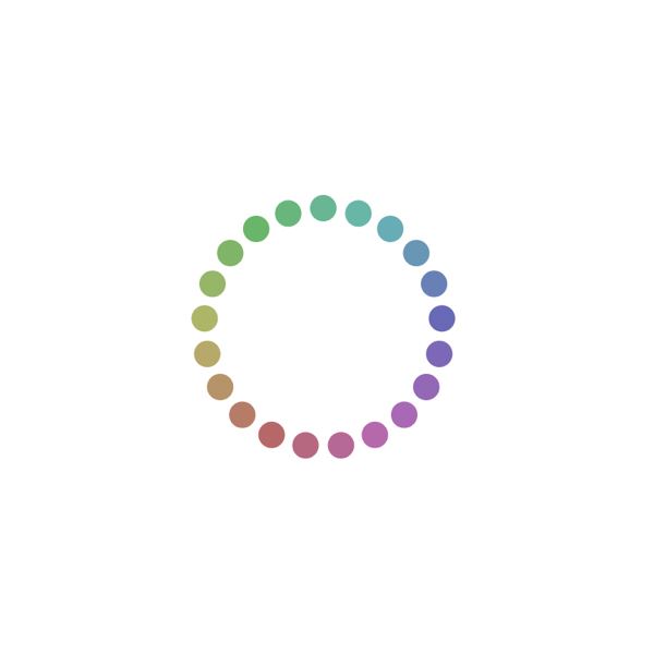
Enter Branition Colors, an exceptional online platform that takes color curation to a whole new level.
Color Theories in Interface Designs

Introduction
Color theory is a critical aspect of UI design. This article will help you learn some key aspects of color theory as they apply to user interfaces and web design.
Introduction of color theories
Color theory is a set of rules that can be used to create pleasing and effective user interfaces. Color theory can be used to create visually appealing designs, as well as help users understand the information they’re viewing on screen. It’s important that you understand the basics of color theory so you can use it effectively in your own designs.
A color wheel provides an overview of how colors relate to one another in terms of intensity, vibrancy, and temperature (warm or cool). Color schemes are combinations of two or more different colors that work together harmoniously within the same design. A color scheme should be balanced between warm and cool tones; otherwise it may feel too chaotic or disorganized.
Warm and Cool Colors
Warm and cool colors are two of the basic color theories that you need to know. They can be used in combination with each other or separately. A warm color is any shade that has a red, yellow or orange tone to it—think of autumn leaves, fireplaces and sunsets; while cool colors are green, blue and purple—think of ice cubes in drinks or winter mornings.
The most important thing to know about warm vs cool is that they have different effects on our minds: warm tones are energizing and exciting whereas cool ones tend to be calming and soothing. This means that when designing an interface for an app or website you should choose your background carefully (it's often not necessary). If you want your users' attention but don't want them feeling tired after using your app all day long then use a warmer background than they would usually use otherwise; if however they need something relaxing then perhaps try using cooler hues instead?
Simplicity in Color Theory
The simplicity of a single color is an ideal way to make your website or product stand out. Usually, this is done by using a single color for the background and another single color for text. This makes it easy to visually separate different elements on your page and also creates a bold statement when paired with contrasting colors or fonts.
Here are some examples:
The Facebook logo uses black as its background and white as the font color (as shown in the example below). When designing interfaces, it's best to choose simple but complementary colors that go well together like these two here do.
Monochromatic Colors
Monochromatic colors are made up of different shades of the same color. The variations in hue create a soothing, harmonious effect that's perfect for creating a sense of order. Monochromatic colors can also be used to create an airy and open appearance.
Monochromatic colors are useful for creating a sense of calm and relaxation, which makes them perfect for minimalist designs.
Analogous Colors
Analogous colors are adjacent to each other on the color wheel. These color schemes are considered harmonious, and create a sense of stability and consistency. The resemblance in hue may help make them easier to read as well. Analogous colors are often used for UI design because they are easy to read, but can also be incorporated into other aspects of branding like typography, illustrations or pattern design.
Purple-red-blue
Yellow-green-orange
Analogous color schemes have long been used by artists and designers as an easy way to create visually appealing color palettes (think Van Gogh!). Not only do they look great, but they’re also easy to work with if you’re looking for something more predictable than mixing complementary hues together (such as red + green).
Complementary Colors
Complementary colors are those that are opposite each other on the color wheel. They create a high level of contrast and can be used to draw attention to an element in a design, such as a button. Because they're so dynamic, complementary colors can also be used to create depth and dimension in your interface designs.
Split-Complementary Colors
Split-complementary colors are based on the complementary color scheme.
Each color is a combination of two complementary colors.
The split-complementary color scheme is a variation of the complementary color scheme that helps you create more harmonious palettes with fewer colors, while still maintaining high contrast between them.
Triadic Color Scheme
Triadic Color Scheme
The triadic color scheme is a good choice for beginners and works well with many images. It’s formed by three colors that are equally spaced around the color wheel. The primary colors (red, yellow and blue) are evenly dispersed at 120 degrees in relation to each other, while the secondary colors (orange, green and purple) are placed at 60 degrees from each other. This gives you six primary variations: red/orange; yellow/green; blue/purple; red/yellow; blue/green; and red/blue — all of which can be used together on any given project.
Pros:
Easy to understand
Works with most images
Can be difficult to use
Tetradic (Double Complementary) and Square Color Scheme
The tetradic and square color schemes are both examples of double complementary color schemes. In a double complementary color scheme, the colors on opposite sides of each other on the color wheel are paired with their complements—for example, blue/orange and green/magenta. This can create a harmonious, balanced palette that is easy to use across multiple design elements such as text blocks, backgrounds and borders.
Both these schemes consist of four evenly spaced colors around the wheel (tetradic) or arranged in an equilateral triangle (square) to form a square-shaped palette.
Make the most out of a plain user interface with effective color combinations.
Color theory is the study of how colors interact with each other. This can be applied to interfaces in two ways:
To create a better user experience, and
To create a better brand identity.
Conclusion
Every interface design has its own purpose and goal. The color theory is one way to make an interface more visually appealing and functional. By using the right combination of colors, you can create a good user experience for your users. You should also consider the user’s cultural background when choosing a color scheme as well as their preferences. However, remember that there is no one-size-fits-all solution when it comes to designing interfaces because every app has different needs


