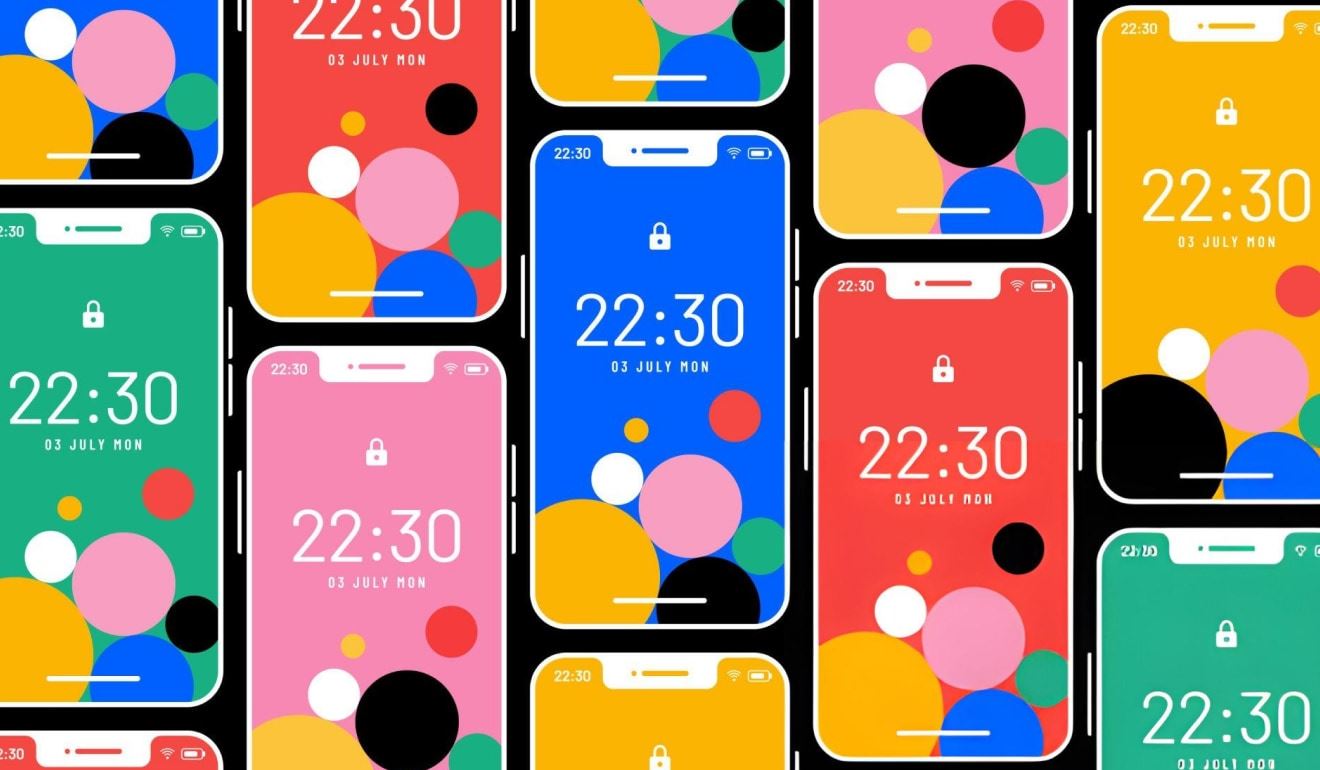
This specific page on Digital Synopsis, a website renowned for covering design, advertising, and visual culture, features a curated collection of beautiful color gradients specifically intended for use as backgrounds. Leveraging Digital Synopsis's expertise in curating inspiring design examples and resources, this page serves as a visually rich gallery showcasing aesthetically pleasing gradients. It provides designers with a source of inspiration and potentially links to external sources where these gradients can be obtained or tools that can be used to recreate them, effectively highlighting the diverse and effective use of gradients in background design.
Using Color to Create Hierarchy in Interface Design

As designers, one of our primary goals is to guide users through interfaces effortlessly. Color is a powerful tool in our arsenal, capable of directing attention, establishing importance, and creating a visual flow. Let's explore how to effectively use color to create hierarchy in interface design.
The Power of Color Hierarchy
Color hierarchy is about using different hues, shades, and tones to organize information and guide users' eyes through an interface. When implemented correctly, it can:
- 1. Highlight important elements
- 2. Group related information
- 3. Create visual separation between sections
- 4. Guide users through a process or flow
Key Principles for Effective Color Hierarchy
Choose a dominant color : Start by selecting a primary color that aligns with your brand. This color will be used for the most critical elements in your interface, such as call-to-action buttons or key information.
2. Use color sparingly : Remember, when everything is emphasized, nothing stands out. Reserve your boldest colors for the most important elements.
3. Create a color palette : Develop a cohesive color scheme with 3-5 colors. This typically includes your primary color, a secondary color, and neutral tones.
4. Employ color psychology : Consider the emotional impact of colors. For example, red can convey urgency or importance, while blue often signifies trust and stability.
- 5. Maintain sufficient contrast
Ensure text and important elements have enough contrast with their background for readability and accessibility.
Practical Applications
1. Call-to-Action Buttons : Use your primary, most vibrant color for main call-to-action buttons. This draws the user's attention to the most important actions.
2. Navigation : Apply a subtle color change to highlight the current page or section in navigation menus.
3. Form Fields : Use color to indicate active fields, errors, or successful submissions in forms.
4. Content Sections : Employ different background colors or borders to visually separate distinct content areas.
5. Progress Indicators : In multi-step processes, use color to show completed, current, and upcoming steps.
- 6. Data Visualization : When presenting data, use color to differentiate categories or highlight specific data points.
Testing and Iteration
After implementing your color hierarchy, it's crucial to test its effectiveness. Conduct user testing to ensure that:
- Users can easily identify the most important elements
- The interface feels intuitive and easy to navigate
- There are no accessibility issues for users with color vision deficiencies
Be prepared to iterate based on feedback and testing results. Color perception can be subjective, so what works in theory may need adjustment in practice.
Color is a subtle yet powerful tool in interface design. When used thoughtfully, it can significantly enhance the user experience by creating clear visual hierarchies. Remember to keep it simple, consistent, and purposeful. By mastering the art of color hierarchy, you'll create interfaces that not only look great but also guide users effortlessly through their journey.
FAQ
Color hierarchy is important because it guides users' attention, establishes the importance of elements, organizes information, and creates a visual flow through the interface. This helps users navigate and interact with the design more efficiently and intuitively.
It's generally recommended to use a limited color palette of 3-5 colors. This typically includes a primary color, a secondary color, and neutral tones. Using too many colors can lead to visual clutter and confusion.
The dominant color, usually your primary brand color, is used for the most critical elements in your interface. It helps to highlight key information and important actions, such as call-to-action buttons, ensuring they stand out to users.
To ensure accessibility, maintain sufficient contrast between text and background colors. It's also important to test your design for users with color vision deficiencies. Tools like color contrast checkers can help verify that your color choices meet accessibility standards.
Color psychology in interface design involves understanding the emotional and psychological effects of different colors. For example, red might convey urgency or importance, while blue often signifies trust and stability. Consider these associations when choosing colors for different elements in your interface.
The effectiveness of your color hierarchy can be assessed through user testing. Observe if users can easily identify important elements, navigate the interface intuitively, and complete tasks without confusion. Be prepared to iterate based on user feedback and testing results.
While it might be tempting to use bright colors for all important elements, it's better to use color sparingly. When everything is emphasized with bright colors, nothing stands out. Reserve your boldest colors for the most critical elements to maintain an effective hierarchy.


